The Approach
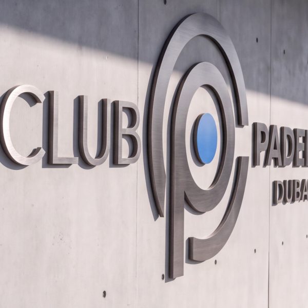
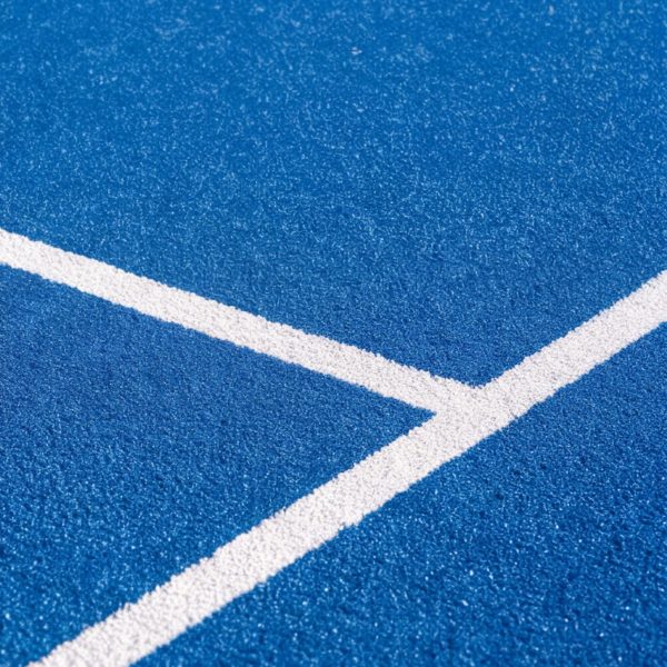
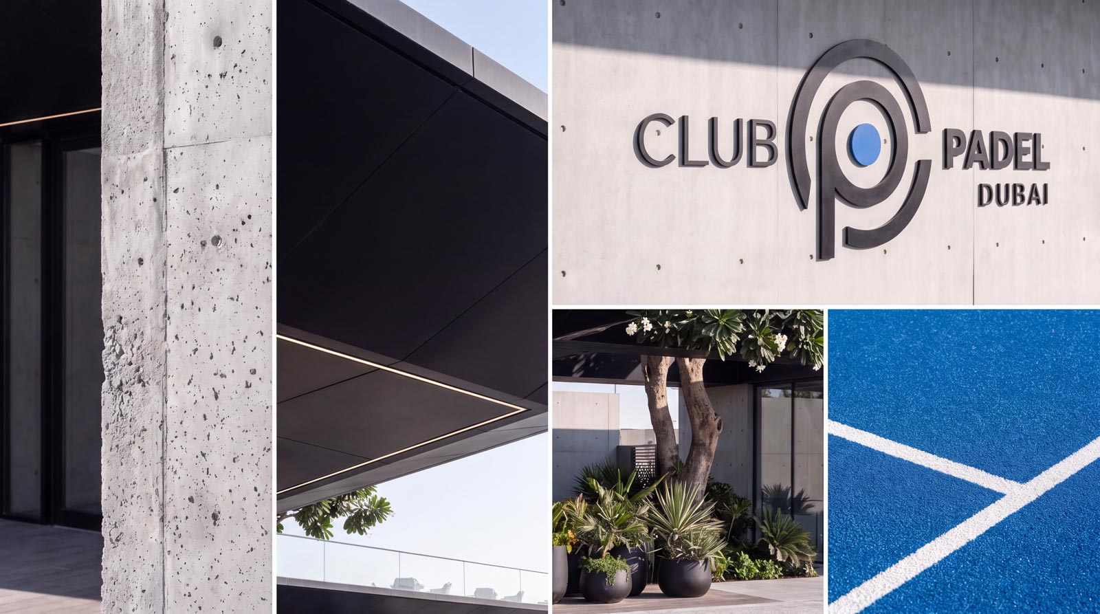
We built the identity from the fundamentals of the sport. Court markings. Ball geometry. The rhythm of the racket. Every element was traced back to something real, then refined into a considered graphic system. The logo itself is the anchor. A "P" enclosed within a circular "C" — the two letters of Club Padel resolved into a single geometric symbol. At the centre sits the ball. The circular form references the racket face, the swept curve of the P references the movement of play. Sketched in isometric 3D as sculptural brushed metal, the mark reads simultaneously as a monogram, an emblem, and a physical object — an identity designed to work at every scale, from a lapel pin to a facade sign. The palette carries the same discipline. A vivid Club Padel blue — drawn from the court surface itself — anchors the system, paired with clean white and controlled black for typography and structure. The colour is immediate, energetic, and unmistakably tied to the sport, while the composition keeps the overall identity feeling confident and premium.
The Approach
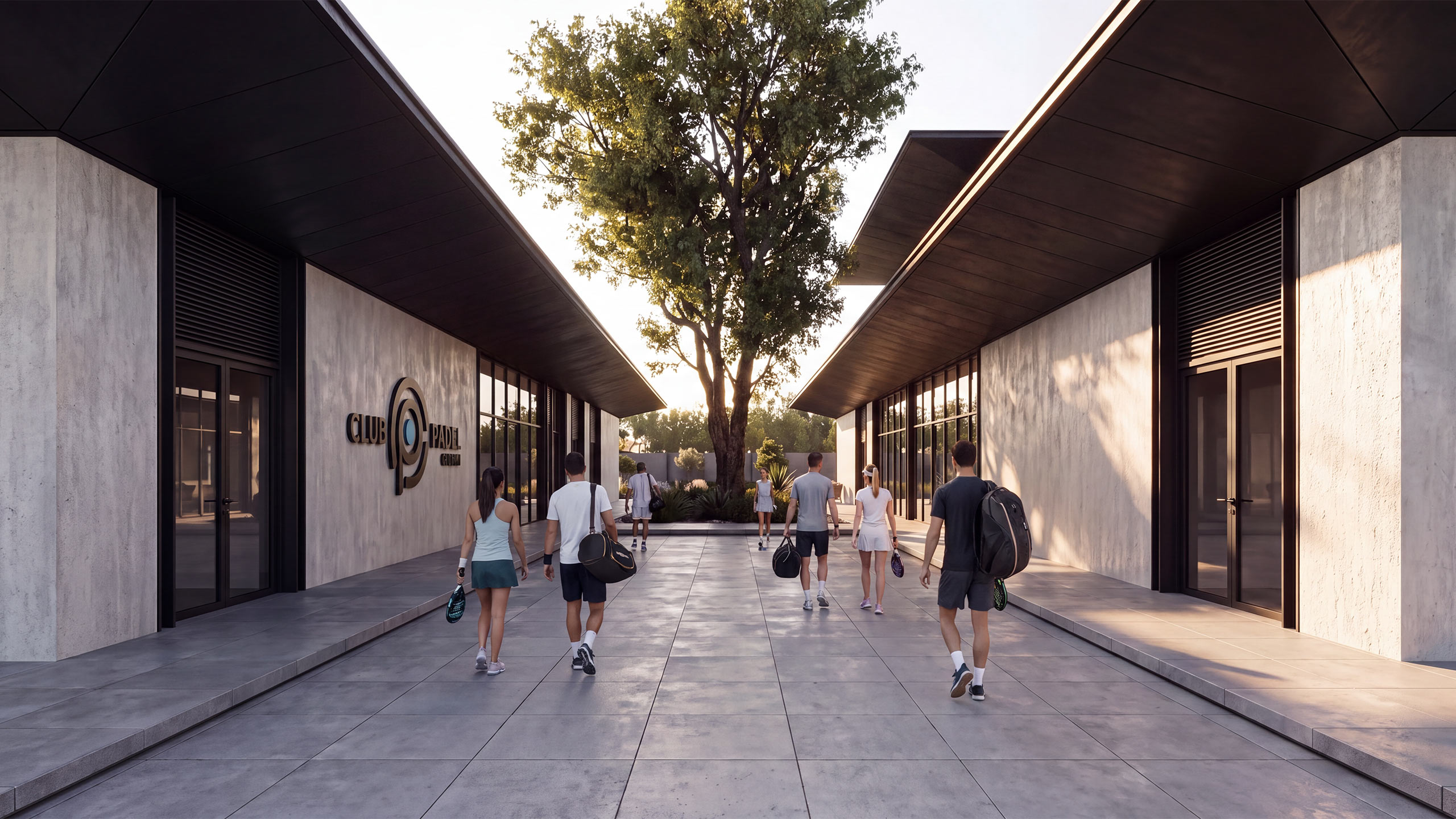
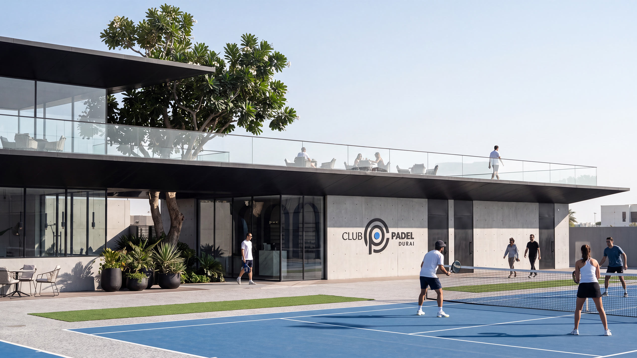
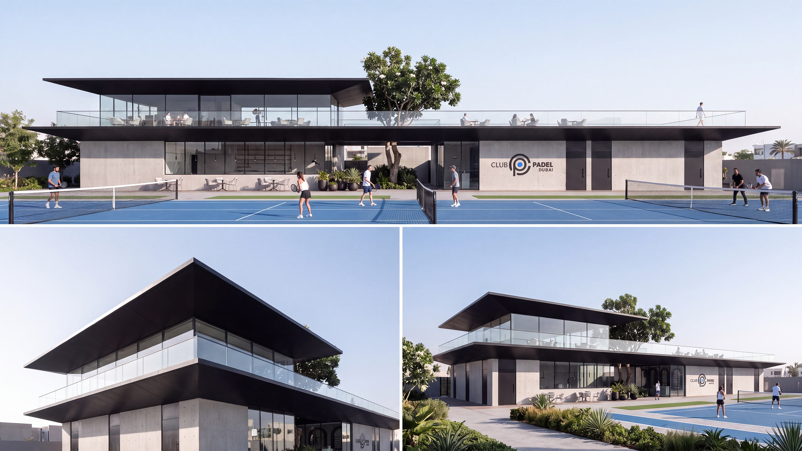
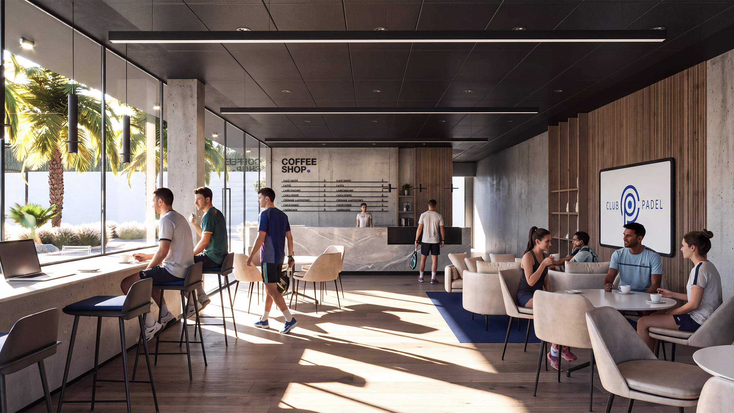
The applications were designed to bring the brand fully into the world it inhabits. The identity now runs consistently across an extensive product line — branded rackets, balls, water bottles, apparel, caps, towels, membership cards, and event merchandise — turning the club itself into a walking, playing expression of its own brand. Signage, wayfinding, court-side flags, and podium branding extend the visual language across the physical environment. Digitally, the identity carries with equal precision. Club Padel's social media presence — Instagram, event coverage, tournament recap videos, member content — is built around the same visual system, giving the brand a consistent voice from the court to the feed. And through the club's sponsorship activity — league branding, tournament partnerships, and co-branded events with athletes and lifestyle brands — the identity has extended well beyond the physical club, appearing at events, in editorial coverage, and across the wider Dubai padel community.